When you want to visualize how a stock or portfolio has performed historically relative to the market as a whole, it is useful to create a comparison chart.
This blog shows how to create a line chart to compare two stocks with Deedle, FSharp Charting and F# Data.
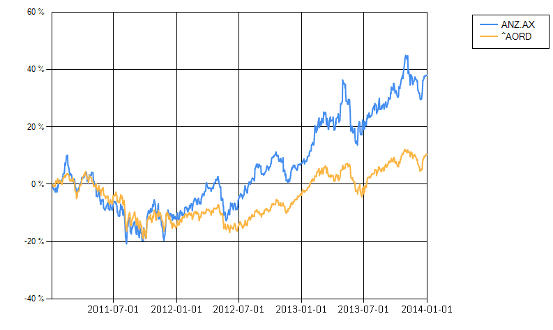
In this example, the chart will show the perfomance of ANZ.AX relative to the ASX ALL ORDINARIES index (^AORD) over a three year period from 2011-1-1 to 2014-1-1.
Starting Out
Deedle, FSharp.Charting and FSharp.Data are available on NuGet, so in the Package Manager Console, execute
Install-Package Deedle
and
Install-Package FSharp.Charting
and
Install-Package FSharp.Data
Create a new fsx file in the project, and call it ComparisonChart.fsx
This post will be structured in source code chunks, and can be consecutively paste them into the fsx file.
Functions to fetch and prepare the data
First we start with some functions to fetch and prepare the data to be charted.
#load "../packages/FSharp.Charting.0.90.6/FSharp.Charting.fsx"

#r @"../packages/FSharp.Data.2.0.9/lib/net40/FSharp.Data.dll"
#r @"../packages/Deedle.1.0.0/lib/net40/deedle.dll"

open System
open System.Collections.Generic
open System.Data
open Deedle
open FSharp.Charting
open FSharp.Charting.ChartTypes
open FSharp.Data

let getHistoricalData symbol (fromDate:DateTime) (toDate:DateTime)  =
    let url = sprintf "http://ichart.finance.yahoo.com/table.csv?s=%s&a=%i&b=%i&c=%i&d=%i&e=%i&f=%i&g=d&ignore=.csv"
                    symbol (fromDate.Month - 1) (fromDate.Day) (fromDate.Year) (toDate.Month - 1) (toDate.Day) (toDate.Year)

    let data = CsvProvider<IgnoreErrors=true,Sample="Date (Date),Open (float),High (float),Low (float),Close (float),Volume (int64),AdjClose (float)">.Load url

    data.Rows
    |> Frame.ofRecords
    |> Frame.indexColsWith data.Headers.Value
    |> Frame.indexRowsDate "Date"
    |> Frame.sortRowsByKey

let asPercentageGain (data:Series<DateTime, float>) =
    let firstItem = data |> Series.firstValue
    let percentageGain = data |> Series.mapValues (fun x -> (x - firstItem) / firstItem )
    percentageGain |> Series.observations
getHistoricalData returns the daily price data for the given symbol from yahoo finance. The Yahoo Finance URL format is pretty cryptic, so a resource such as http://www.gummy-stuff.org/Yahoo-data.htm is important if you want to figure out what the query string parameters mean.
The Yahoo Finance data is fetched in CSV format, and is parsed by the FSharp.Data CSV type provider. Note that when CsvProvider is instantiated, a sample is given describing the fields in the CSV returned by Yahoo Finance along with type names in brackets. Using a type provider significantly simplifies fetching the CSV data, cutting down on the amount of boiler plate code.
The CsvProvider represents data as tuples, so we need to include “Frame.indexColsWith ata.Headers.Value” in the piping statements in order to ensure the column headers are correct (i.e. Date, Close, etc), otherwise the headers will be named like Item1, Item2, etc.
asPercentageGain transforms a price series into a series where each entry represents the percentage gain or loss from the price on the first day in the series. The result of this can be used to build comparison charts.
Fetching the data and creating the chart
Now we’re ready to start creating the chart. Note that to properly compare performance, the same fromDate must be used for all stocks, so that both charts start at a gain of 0%
Note that the chart is Y-Axis is formatted using the Percent (“P”) Format Specifier with 0 decimal places (“P0”)
let fromDate = DateTime(2011, 1, 1)
let toDate = DateTime(2014, 1, 1)

let anz = getHistoricalData "ANZ.AX" fromDate toDate
let aord = getHistoricalData "^AORD" fromDate toDate

Chart.Combine
    [ Chart.Line(anz?Close |> asPercentageGain, Name = "ANZ.AX")
      Chart.Line(aord?Close |> asPercentageGain, Name = "^AORD") ]
|> Chart.WithLegend(Enabled = true, InsideArea = false)
|> Chart.WithYAxis(LabelStyle = new LabelStyle(Format = "P0"))
If all goes well, running the FSX script should generate a chart such as: